

There is a particular moment in many website projects when everything appears to slow down.
The colours have been discussed. A few example websites have been admired. Then the practical questions begin.
Which services need their own page? Who is each service for? Can people see a price? What happens after they enquire? Which jobs should they be able to book? How quickly can the business respond? Who is responsible for the response?
Suddenly, building a website for your business no longer feels like a design task. It feels like being asked to explain the entire business while somebody waits with a cursor blinking.
This is not because the owner is bad at websites. It is because a website makes implicit decisions visible. A business can operate for years on experience, memory, exceptions and conversations. The website cannot lean across the counter and say, “It depends, but I will know what to do when I see it.” It needs enough structure to help the right person take the right next step.
The blank page is not actually blank
A blank website page looks like a writing problem. Usually, it is a decision problem wearing a very white shirt.
Consider a service page. To write it clearly, somebody needs to decide what the service includes, who benefits, what evidence a customer needs and what they should do next.
None of those decisions belongs to the website software. They belong to the business.
The theme can supply a heading. The page builder can supply a button. Neither can decide what promise the heading should make or where the button should lead.
The Australian Government’s guidance on developing a marketing plan starts with the target market, the reason people need the product or service, the business’s positioning and the channels used to reach customers. That is marketing language, but it is also website language. A homepage is a practical expression of those choices.
A website asks for decisions in public
Inside the business, ambiguity can be surprisingly comfortable. Staff know what “the usual package” means. Regular customers know to call rather than fill in the form. Prices may live in a spreadsheet, an old email and someone’s head, with three slightly different versions doing their best.
A website asks the business to make some of that shared knowledge legible to a stranger.
This is closely related to the argument in “Your Website Isn’t Broken. Your Business Model Is.” The difference is timing. Sometimes the project has simply reached the first moment when a workable but informal model must be described clearly enough for somebody outside the business to understand it.
The questions that make the project stall
What exactly do you sell?
Many businesses sell something more specific than the label on the invoice.
The service should be explained in terms of the customer’s situation, the work involved and the result the business can responsibly offer. If one service name covers several different jobs, the website is not creating the confusion. It is showing where the business’s language and the customer’s language have drifted apart.
Who is it for, and who is it not for?
“Everyone” is emotionally generous and operationally expensive.
A useful website should help visitors recognise whether an offer fits their situation. Government digital-service guidance similarly begins with knowing the user, including their context, needs, frustrations and current experience.
For a small business, this may mean stating the service area, typical project size, lead time, prerequisites or the kinds of problems the service solves. These details reduce uncertainty and avoid turning every enquiry into a small detective story.
What happens after somebody says yes?
A button labelled “Get started” creates a small but real question: started doing what?
Will the customer book a time, request a quote, pay a deposit, upload information or wait for a call? Who receives the notification? What happens if the request is urgent, incomplete or outside the service area?
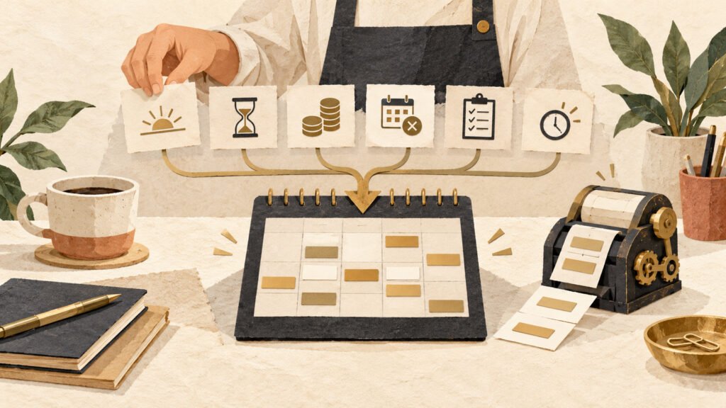
These are workflow questions. They are also website questions because the customer encounters the workflow through the site. Our article on why a booking system should not run the business makes the same point in a narrower setting: the tool should implement decisions about availability, lead time and exceptions, not invent them by default.
What does it cost?
Pricing is rarely a choice between publishing one perfect number and saying nothing.
A business might show a fixed price, a starting price, a range, example packages or the factors that affect a quote. Current business.gov.au pricing guidance asks owners to consider costs, the market and the value provided to customers. That is business work before it is website copy.
Displayed prices also need to be accurate and clear. The ACCC says businesses must avoid creating a false impression and, where applicable, display a total price that includes unavoidable or pre-selected extra fees. Its price-display guidance is worth checking before a pricing page becomes decorative arithmetic.
Design cannot rescue an undecided offer
Good design can create hierarchy, reduce confusion and make an honest offer easier to understand. It cannot make three conflicting service descriptions become one coherent service.
When decisions are missing, the temptation is to add design. Another section is created. A set of icons appears. A paragraph becomes a carousel, perhaps because movement feels like progress. The page grows, but the customer’s question remains unanswered.
This is one reason clear websites take more work than cluttered ones. As discussed in “Simplicity Is Expensive to Create,” useful simplicity is the result of exclusions, naming and operational discipline. It is not achieved by making the font smaller and hoping the contradictions look tidier.
The fairest thing a web designer can do is identify which questions are design questions and which are business questions. The fairest thing an owner can do is accept that some answers may be provisional. A first version does not need to settle every future possibility. It needs to represent the business truthfully enough for the next useful customer action.
This discomfort is not a sign that the project is failing
In fact, the awkwardness can be evidence that the project has reached something valuable.
If the owner is debating whether two services should remain separate, that is more useful than debating whether two boxes should sit side by side. If the team discovers that nobody owns enquiries from a particular form, that is worth knowing before the site sends more of them. If a pricing page reveals that identical jobs are being quoted three different ways, the problem existed before the page did.
The website is acting as a practical mirror. Mirrors are not always flattering, but blaming the mirror has a low success rate.
Write down four provisional decisions: the main customer, the main offer, the next action and what happens after that action. A useful first version is better than asking the design to disguise four blank spaces.
A website brief feels uncomfortable because it turns private habits into public promises.
Treat the website as a decision-making project
A website project becomes easier when the team stops pretending that every uncertainty can be solved in the design file.
Separate reversible decisions from consequential ones
Button wording is easy to change. A deposit policy affects customers, cash flow and administration. A photograph can be replaced. A promise of same-day response may create an ongoing staffing expectation.
Mark the consequential decisions and give them proper attention. Do not spend the same amount of energy choosing a border radius as deciding who will answer quote requests. One is visually noticeable. The other determines whether the website can keep its promise.
Use provisional language honestly
Not every business has enough evidence to make a permanent decision. A new service may not yet have stable pricing. A new booking process may need to be tested. In those cases, write a responsible first version: a starting price with clear scope, a limited pilot, a stated service area or a manual enquiry pathway while the process is learned.
“Provisional” should not mean vague. It means the decision has a review date and somebody owns the learning.
Build one complete customer pathway
Choose one important visitor and follow their journey from arrival to a sensible next step.
What are they trying to decide? What information do they need? What might make them hesitate? What action can they take? What does the business do when that action arrives?
This exercise prevents the site from becoming a collection of disconnected pages. It also reveals where a small amount of purposeful friction helps. A qualification question, price indication or preparation step may create a better handoff for both sides, which is why removing every website barrier is not always the kindest choice.
What your web person actually needs
A useful brief does not require polished copy or a fifty-page strategy document. It requires enough reality to work with.
- The main customer situation: what has happened in their life or business that makes them look for help now?
- The offer: what the business will do, what is usually included and where the boundaries sit.
- The next action: the most useful thing a suitable customer can do from this page.
- The handoff: who receives that action, what they need and what happens next.
- The evidence: genuine examples, credentials, process details or answers that help the customer judge fit.
- The constraints: service area, capacity, lead time, pricing approach, eligibility or circumstances that change the process.
Some of these can be discovered collaboratively. The owner does not need to arrive with a perfect binder. But the final decisions should remain recognisably theirs. Otherwise the website quietly begins to design the business around what was easiest to put in a template.
When to pause the build
Pausing is sensible when a decision would create a real operational, legal or financial commitment and the responsible person has not considered it.
Examples include taking payments, publishing cancellation terms, collecting sensitive information, promising availability, setting delivery areas or naming an all-inclusive price when the scope varies substantially.
Do not pause because a sentence is imperfect. Do pause when the sentence would make a promise the business cannot reliably keep.
A short pause for a real decision usually saves more time than weeks of design revisions around an unresolved issue. The website can then return to being what it should be: an implementation of deliberate choices, not a very attractive meeting that never ended.
A practical one-hour exercise
Pick the website page that has been hardest to finish. Set a timer and answer these questions in plain language:
- Who arrives on this page, and what are they trying to work out?
- What can the business responsibly promise them?
- What must they know before taking the next step?
- What is that next step?
- Who owns the response, and what happens after it arrives?
- Which answer is still uncertain, and when will it be reviewed?
Do not write website copy yet. Write the business answers. Once those are coherent, the page structure usually becomes much less mysterious.
The useful lesson
Building a website can feel hard even when the technology is behaving perfectly. The project is asking the business to name what it does, choose whom it serves, explain how work begins and turn familiar habits into promises a stranger can understand.
That work deserves more respect than “just send us some content”. It is part strategy, part operations and part customer care.
The goal is not to eliminate every uncomfortable question before design begins. It is to notice which questions belong to the business, make the consequential decisions deliberately and let the website express them clearly.
When that happens, the site becomes easier to build for the same reason it becomes easier to use: everyone knows what it is there to help people do.
Is the website project exposing unfinished decisions?
We can separate the business questions from the design questions and build the customer pathway in the right order.
Keep reading
Your Booking System Shouldn’t Run Your Business
Booking software can remove admin, but only after the business has decided what can be booked, when, by whom and on what terms.
Read article →
Every Website Form Should Have One Job
A practical way to decide what a website form should ask, where its answers should go and how it can reduce work for customers and the business.
Read article →
Your Website Isn’t Broken. Your Business Model Is.
Website problems often begin with unresolved decisions about services, pricing, capacity, policies and customer fit. Use your website project to find and fix the right problem.
Read article →